Theming
The integrations are written to be themed, so that brand colors and typography are seamless across your brand's website. Below is an example of our integrations with and without a theme override stylesheet.
| Without theme override | With Theme Override |
|---|---|
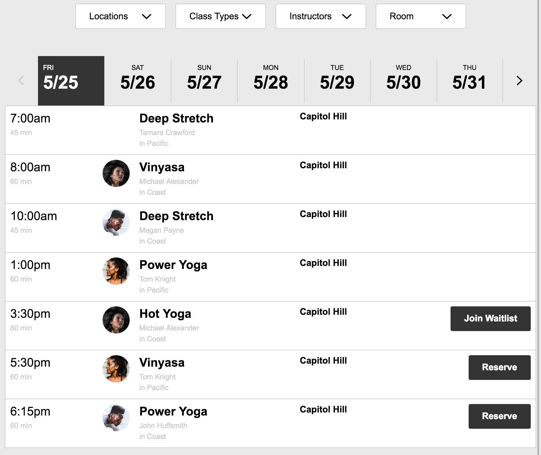 | 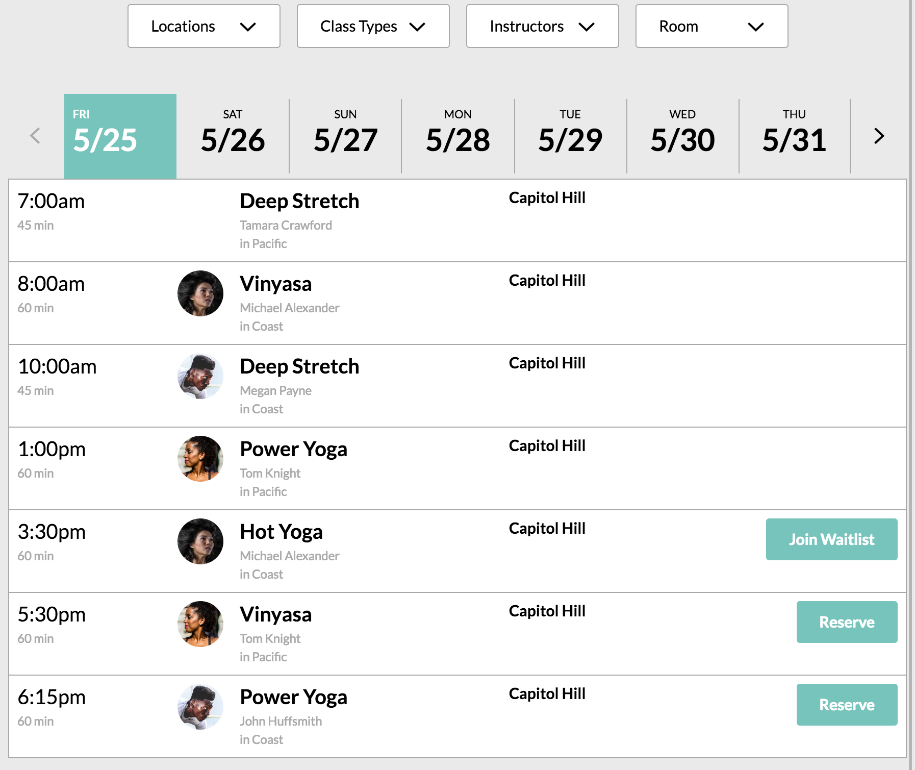 |
The theme css classes are all written in an object oriented manner with very low specificity so that you have granular control while theming our integrations. Our integrations are also written with very low specificity so that they will inherit your site's base styles where applicable and you can easily override anything you want without resorting to crazy long selectors or lots of !important declarations.
Note: please put the integrations stylesheet before your site's stylesheet(s)
Writing a theme override
An integrations theme consists of a primary, secondary, default, lowlight, inverse, and danger color. Each of these colors has a separate class in order to specify the background-color, border-color, and color/fill CSS properties. The full matrix of theme colors and property specific classes is as follows:
background-color | border-color | color | |
|---|---|---|---|
| primary | .MT_bg--primary | .MT_border--primary | .MT_color--primary |
| secondary | .MT_bg--secondary | .MT_border--secondary | .MT_color--secondary |
| default | .MT_bg--default | .MT_border--default | .MT_color--default |
| lowlight | .MT_bg--lowlight | .MT_border--lowlight | .MT_color--lowlight |
| inverse | .MT_bg--inverse | .MT_border--inverse | .MT_color--inverse |
| danger | .MT_bg--danger | .MT_border--danger | .MT_color--danger |
| disabled | .MT_bg--disabled | .MT_border--disabled | .MT_color--disabled |
Written out in CSS, a theme override stylesheet looks like:
.MT_component {
    font-family: "Lato",sans-serif
}

.MT_bg--default {
    background-color: #000
}

.MT_border--default {
    border-color: #000
}

.MT_color--default {
    color: #000;
    fill: #000
}

.MT_bg--lowlight {
    background-color: #aaa
}

/* and so on... */
Writing a theme override with a preprocessor
If you use a preprocessor a theme reset can be accomplished with even fewer lines of code. The following example uses the .scss syntax of Sass.
.MT_component {
    font-family: "Lato",sans-serif
}

$colors: (
    text: #000,
    border: #979797,
    lowlight: #AAA,
    primary: #76C4BB,
    secondary: #63518F,
    danger: #C00,
    inverse: #FFF
);

@each $color-key, $color-value in $mt-colors {
    .MT_bg--#{$color-key} {
        background-color: $color-value;
    }

    .MT_border--#{$color-key} {
        border-color: $color-value;
    }

    .MT_color--#{$color-key} {
        color: $color-value;
        fill: $color-value;
    }
}
Showing Availible Spots on the Schedule
See the How Do I Show My Users How Many Spots Are in Each Class? section of the Schedule Integration page.